I set up a meeting with the leadership team of our department, to be held just about a month from now, to review my take on near and long-term trends in the social collaboration/social learning technology space.
This is something we routinely do. We step back and look at trends as we review the mix of technology platforms we use to create the learning environment for our masters degree program. How might we create a digital workplace for our community, where the work is learning? What technology environment do we need to create that will provide a way for our students to explore what it takes to work – and lead – in the digital workplace?
In this post, I’m working out loud about the process of drawing and creating visuals. I need to go from where I am today – when I have a messy visual that makes sense to me – to creating a visual which helps makes sense and builds alignment with the leadership team.
In subsequent posts I’ll explore in more detail my own sense-making about the trends I am seeing as I look across three contexts:
- What is happening in the general workplace setting, and the emerging technologies that are designed to help practitioners do work better?
- What technologies are emerging in the workplace learning setting? Oddly and also predictably, this setting is always somehow separated from the general workplace setting. (With exceptions such as Harold Jarche, who has been seeing through this false distinction for years).
- What is happening in higher education, and the emerging technologies supporting teaching and learning? Here, I pay attention to general trends but also tap into my network of higher ed innovators who think deeply, and differently, about digital and open pedagogy.
Drawing out loud v1
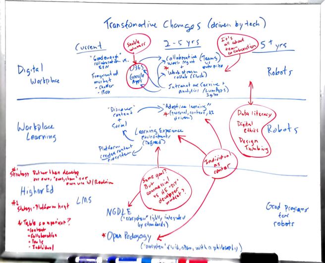
This in the whiteboard in my office.
I spent about an hour late last week to map this out; door closed, after a week or two of occasionally exploring various industry analyst reports looking at future trends. I have been recording my exploration with text notes (using Box Notes in a shared team space) along with snapshots of interesting tables or graphics.
There was a lot going on in my head. I don’t routinely draw out my notes as I go along (that’s a next step for me). But I do often stop when I feel there is a lot going on in my head and it needs to get out in some more coherent form. That’s when I go to the whiteboard.
Looking back at this whiteboard drawing, I see a few things.
It’s really text-based. But structured within a space (vs. paragraphs, for example).
It’s also really a table. Columns and rows. The columns are time periods (current, 2-5 years out, 5+ years out) and the rows are contexts (digital workplace, workplace learning and higher education).
If there were a time-lapse video of me drawing you would see that I started by first laying out the table – writing out the title and then the column headings and rows.
I then drew horizontal lines to separate the rows. I think I did this because I really wanted to first concentrate on mapping out the key themes emerging from each context (i.e., digital workplace, workplace learning, higher ed) as trends in time (current, 2-5 years, 5+ years).
I say “I think I did this” because I knew – at the time I started the drawing – that I wanted to explore the connections across contexts. But that’s not where I started. I started within contexts in horizontal rows. It wasn’t exactly a conscious plan. Yet it makes sense now that I reflect on it.
Once I had the table layout set up, I wrote (in blue) labels for specific technologies or technology categories that were used in the analyst reports. Ex: “Collaborative work mgmt,” “Intranet as a service,” “Adaptive learning,” “NGDLE” (next generation digital learning environment).
Still using blue, I then started to add some conceptual themes to the picture, with arrows to show relationships. Ex: “‘Discover content + social'” is my own synthesis of themes related to adaptive learning and learning experience environments (two labels for different types of emerging workplace learning technologies/platforms). The relationship arrows are off – really both arrows should point toward the concept – but I was attempting to indicate that both adaptive learning and learning experience environments seem to share a basic design goal of helping learners discover content (no matter where it is), and engage in some level of social interaction.
I then switched to red. I think I was sensing that I was moving toward synthesizing larger themes and that red would help me see them more clearly. I also started to very explicitly think about, and work on, the connections across contexts. Which is where I hoped to end. Ex: In the digital workforce row, the next wave of collaboration technologies is really focused on work teams (vs. , say, larger networks of communities).
Red also allowed me to add some things that did not exactly fit into the logic of the table. Data literacy, digital ethics and design thinking are three domains of know-how that some analysts point to as growing in their importance or influence. At the bottom left of the whiteboard, I also made note of an idea for another table – comparing collaborative work management systems, adaptive learning systems and open pedagogy in how they treat content, collaboration and individuals, and what tools are currently used to do that. The red asterisks tie those notes to the three technology labels.
So where does this leave me?
I landed on a few things in red (and some in blue) that are interesting and possibly important themes to share with the leadership team.
I wanted to think about connections across contexts (vertical) but started by working things out horizontally. That seems to work for me.
Colors and arrows helped me add dimension to my thinking. I moved from “here are some labels for trends” to “here is how I am making sense of what might be important to share with the team.”
I’ll also note that, as I write this, I can see elements where my synthesis may be oversimplifying things. How “open pedagogy” views the individual learner as a participant in a larger network of learners is very different from how “adaptive learning” views the individual learner as a participant in a larger network of learners. The former is owner; the latter is consumer.
My next step:
Draw again. See if I can come up with another version that gets me closer to clarity for my purpose: A visual for discussion with a leadership team to generate some alignment on what we change (or don’t) in our technology platforms.
Drawing out loud v2

This is the next update to my whiteboard. I erased v1 and then started by first drawing out circles to represent what appear to be the big categories of technologies – i.e., office suites, collaborative work management, adaptive learning, etc.
One of the things that struck me in v1 is how I might try to compare how each of these systems types “thinks” about the relationship between people and content, people and other people, etc.
In v2 I started attempting to draw out those relationships (the drawings in red). This version is really half-baked, but I like where this is leading me.
My experience in evaluating technologies (I’ve been doing this for, ahem, awhile) has always led me to look for the underlying orientation or point-of-view upon which the system is designed. This helps cut through vendor bullshit.
My colleague Melinda Turnley – another experienced technology evaluator – also looks at platforms this way. Melinda first pointed out how a lot of the “enterprise social” systems we were reviewing had a decidedly “internal communications” point of view; they are designed to solve the challenges of central, internal comms professionals. How do we make sure content gets pushed to the right people? How do we facilitate blog post ghost writing for our senior executives? (Yes, I know. That is a real thing. Insert rant here.) It’s a lot about push and targeting and controlling who creates content. Not a lot about free-form collaboration and widely distributed content creation.
That’s a decidedly different orientation than Slack, for example. Slack is about conversation. And a particular type of stream-based conversation that happen in distinct, separate channels.
To me, it’s always been important to understand these orientations because if you try to push too hard against them to address your own needs, you’ll lose. Ask anyone who has tried to make their LMS act like a truly “social” platform where students collaborate and learn informally outside of the formal class structure.
So my starting to draw the relationships among people and content within different categories of systems is my attempt to synthesize what I am seeing, graphically.
I’ll create more for a v3 to share here to show what I mean.
Drawing out loud v3
For the record, it’s been a few weeks since my last update (holidays, winter break, etc.). I’ve only had a slight shift in my thinking about what to draw next. I still want to capture the relationships among people and content. But I thought I might start with a current ideal visual – something that is actually very close to what we do today in our learning community.
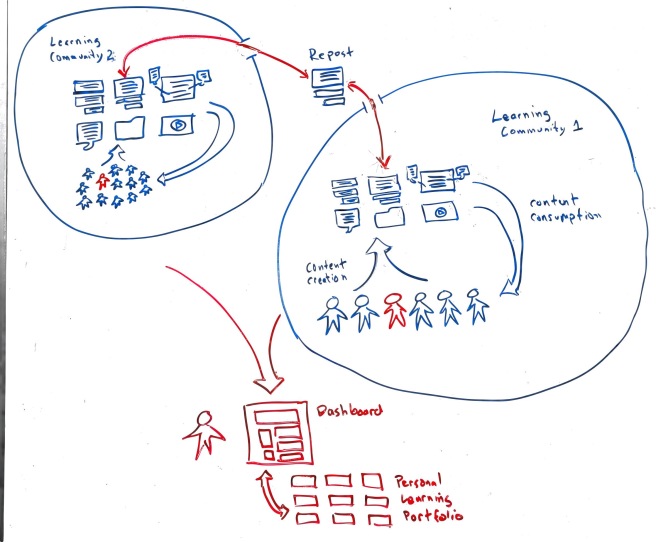
The key elements of our vision of a community for learning is that it is very social and community based. It’s not about fine-tuning how to deliver content to the individual learning. It is about helping the individual learning participate in communities (contributing and consuming) and about helping them self organize their content in ways that are meaningful to them (dashboard and personal learning portfolio).
The content icons I drew are intended to represent a variety of content forms that forefront social interactions. Documents with comments, discussions, blog posts, video, micro posts, annotated files and visuals, etc. In our vision, each community space allows for more and more types of these content forms, and everyone in the community has rights to create and consume them.
Key to this v3 representation also is the relationship of communities to each other, and to individuals within each community. Learning Community 1 can be viewed as a smaller community of interest or practice. Or a group working on a specific project. Learning Community 2 is a larger community; it’s the community from which Learning Community 1 members are drawn. The idea is to have bounded communities (Learning Community 1) but with some leakiness that allows individuals to repost or share content that might be of interest to the larger community. This small-and-private plus larger-and-more-public structure works exceptionally well in our current learning community.

Jeff – this is great – I love the different versions of your visual thinking! I struggle with this concept in the shared learning space of my industry. So much is still oriented toward boundary based sharing (not sure that’s a real terminology) – but we limit our sharing internally (we don’t use Slack, we used permission granted Sharepoint, and tons of email).
I’ll stay tuned and read often to learn how you synthesize this further.
LikeLiked by 1 person